Sunday 15 May 2011

Character sketch


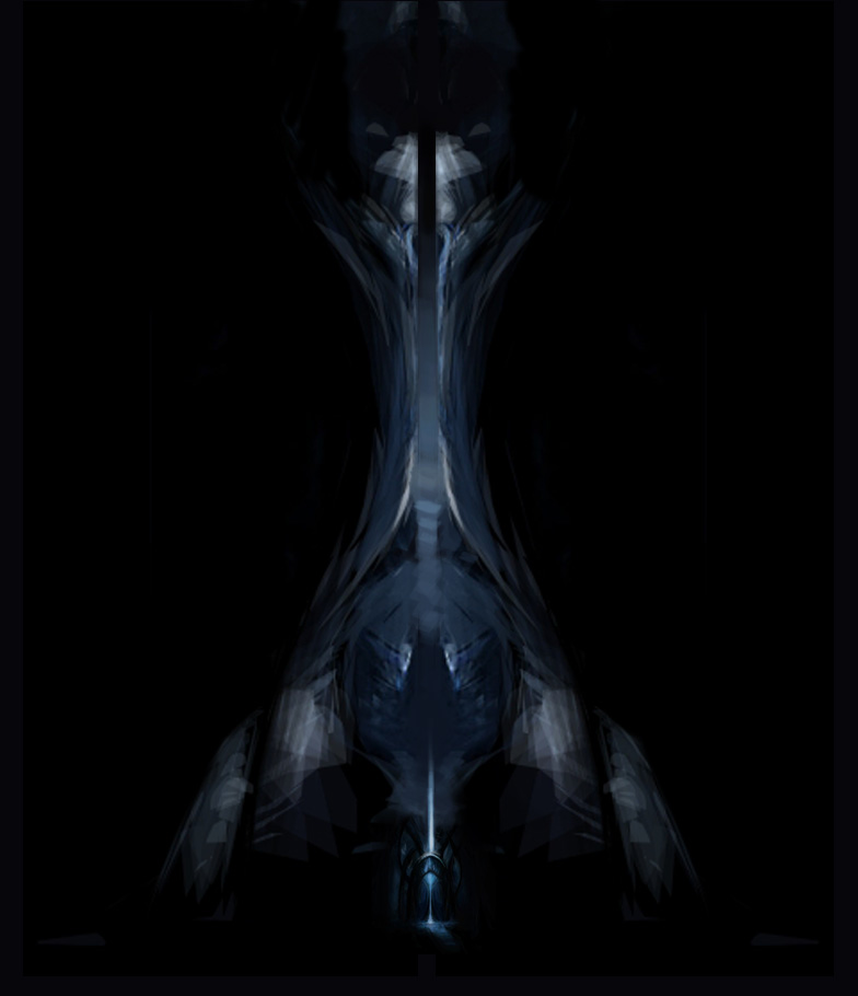
I thought it would be cool to have a characters face flash up at the end of the graphic novel in a short video. I will create this video at the end if I get time. I have no development for this because it was just a quick concept piece. I added an image of elephant skin on top for the skin texture which i think looks quite good.

Saturday 14 May 2011

pieces that didnt make it

I nearing the time now where I have to create the website and start to decide which pieces are good enough.

I created this piece in under 90 minutes;


I disliked this piece as soon as I finished it. It will not being into the graphic novel

hades ship

I created this piece in Alchemy and then changed values in photoshop. I wanted it to look like an aggressvie war ship. I thought if I made the front come to point like a razor then I would achieve this look.


You can see how the piece developed because I saved it so much because you cannot undo in Alchemy.

Piece for locations

I needed a few new pieces because I only had three locations. I created some speed paintings only keeping in mind a futuristic style and the colour palette.


 This piece changed dramatically about half way through. The reason for this was I knew I wanted mountains in the piece so I painted the composition and texture from reference and then changed the values until I was happy. I found this quite an easy way to create a piece that is quite far from reality but still being relatable to our world. 


5 locations

I have decideed to create 5 locations for the viewer to understand the fictional world a little better.
When I was creating these I thought it would be cool to name the planets after greek gods. Each have a personality trait which relates to the planet. This may help the viewer learn more about the planets if they look for information.

I will be turning these images into video files by fading in the images and moving the text slightly across the bottom of the page.

Each planet has its own planet. I did this to identify where ships or characters have come from without having to say. Also I think it adds a dynamic to the art direction.

These worlds are;


concept change

I have realised that it is very difficult to create images that show action but no narrative. I have decided to change my idea slightly and give the images a pre existing narratrive but show it in a non linear fashion so the viewer has to work it out themselves. To add to this there will be hidden pages with more information on them if they click on parts of images that interests them. For example there may be a planet in the background of an image. If the player wishes to know more they can click on the planet and they will be taken to the planets own page.

I have thought about this and I think it could work well if advertisment was embeded into the narrative for example a company could be involved in the narrative and its logo could be placed strategically in the graphic novel. If the player clicked the logo they would be taken to their home page.

Thursday 28 April 2011

graphic novel: concept 7

Development for the second piece of the blue environment.

Tuesday 26 April 2011

graphic novel: concept 6

I decided to go back to one of my quick sketches from the start of the project and develop it further.


Here I added more detail and changed the hue and saturation, I also applied a filter.

I added a buildng texture and began to paint over it. Here the quality isnt very good, which needs to be changed.


Monday 25 April 2011

developing old concepts

I took the first concept that I created using Alchemy and began to change it to suit the brief.
original piece

Here you can see i tried turning it into a more distinctive building.  I disliked the shape here though and it still lacks relevance.
Here I added the previous blue concept piece at the bottom, so it looks like this is the main building and the next concept piece is the entrance.

Here I added detail as well as the sky and a moon. I think this piece will work well when it is paired with the other concept piece. 


Friday 15 April 2011

graphic novel: concept 5

 I created this quick design of a building. I originally had the design in blue but I didnt think it was working so I changed the hue and saturation.


I then began to add small details in to the piece.

Graphic novel: concept 4

This is a concept for the same space station. This image gives the viewer a better understanding of the planet. I think this could be used along side the previous piece concept 3.

I have been trying to link the colours in from the different pieces by showing two distinctive colours in each. I think this works well because of the space enviornment.


 Here I added the villain firing missiles at the other ship in the distance.

 This is the development for the spaceship in the images above. I reated it in Alchemy.


graphic novel: concept 3


 This is a quick digital painting of the ship docking to what seems like a ship/space station that is much bigger.


graphic novel: concept 2

Here I created three digital paintings for one page of the graphic novel. It is meant to depict a planet being destroyed by a missile emitting green light.

graphic novel: concept 1

 I decided to put three images of the ship moving together to create one page rather than create an animation. I think it shows the ship moving quite well considering it is a static image that I have moved and resized. 

Monday 4 April 2011

The watchmen

The watchmen is probably one of the most iconic graphic novels because of its popularity. I think the release of the film helped to get the graphic novel noticed by a larger demographic.

The artistic direction for this graphic novel cannot be judged however it is not a route that I wish to persue myself. Many would argue with me but I think it appears dated now considering it was created in the 80s. The drawings flow well which was a necessity because the narrative is so complex. I will need to consider the flow of my work when I create my graphic novel.

Speed painting

I have found in the this project I need to improve at speed painting to get ideas out fast and then move on.


I created this piece in a few minutes, it is not a finished piece but more of a representation of what it could look like. I like creating pieces like because I can show the values of the piece at the beginning rather than changing it later on.

Random designs

I decided to create some random designs fir this project that I could then tie in later. I decided to use photoshop and alchemy to create them.


Some of these designs dont fit with the project but are useful techniques that I havnt used before such as the tree. I think the last design could be developed for this project.