Thursday, 28 April 2011
Tuesday, 26 April 2011
graphic novel: concept 6
I decided to go back to one of my quick sketches from the start of the project and develop it further.
Here I added more detail and changed the hue and saturation, I also applied a filter.
I added a buildng texture and began to paint over it. Here the quality isnt very good, which needs to be changed.
Monday, 25 April 2011
developing old concepts
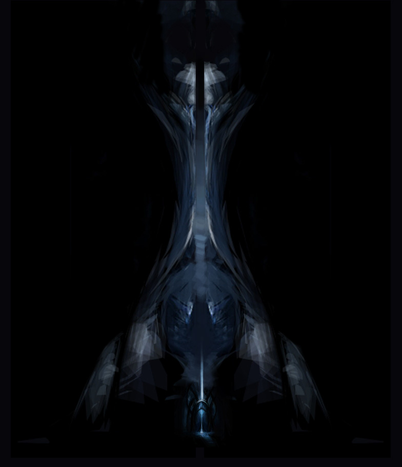
I took the first concept that I created using Alchemy and began to change it to suit the brief.
Here you can see i tried turning it into a more distinctive building. I disliked the shape here though and it still lacks relevance.
Here I added the previous blue concept piece at the bottom, so it looks like this is the main building and the next concept piece is the entrance.
![]() |
| original piece |
Here you can see i tried turning it into a more distinctive building. I disliked the shape here though and it still lacks relevance.
Here I added the previous blue concept piece at the bottom, so it looks like this is the main building and the next concept piece is the entrance.
Here I added detail as well as the sky and a moon. I think this piece will work well when it is paired with the other concept piece.
Friday, 15 April 2011
graphic novel: concept 5
I created this quick design of a building. I originally had the design in blue but I didnt think it was working so I changed the hue and saturation.
I then began to add small details in to the piece.
Graphic novel: concept 4
This is a concept for the same space station. This image gives the viewer a better understanding of the planet. I think this could be used along side the previous piece concept 3.
I have been trying to link the colours in from the different pieces by showing two distinctive colours in each. I think this works well because of the space enviornment.
Here I added the villain firing missiles at the other ship in the distance.
This is the development for the spaceship in the images above. I reated it in Alchemy.
I have been trying to link the colours in from the different pieces by showing two distinctive colours in each. I think this works well because of the space enviornment.
Here I added the villain firing missiles at the other ship in the distance.
This is the development for the spaceship in the images above. I reated it in Alchemy.
graphic novel: concept 3
This is a quick digital painting of the ship docking to what seems like a ship/space station that is much bigger.
graphic novel: concept 2
Here I created three digital paintings for one page of the graphic novel. It is meant to depict a planet being destroyed by a missile emitting green light.
Subscribe to:
Posts (Atom)